My name is Maria E. Sterr. I am currently studying animation, which I like to do in my freetime. Outside of that I like to go on walks and watch TV. I am trying to do more of the former than the latter activity.
For these sets of images the hardest part was the character turns. I was afraid that I would not be able to make the turn consistent. When I was drawing them I made sure I had guides to at least stay consistent with the height of the character. The hat was also a bit difficult since I had to figure out its relationship to the hair and earmuffs as well as how it would look at different angles for the character.
This is seen in both the character turns and expressions since I mainly kept the design of the focus character the same. I adjusted the color of her jacket and added a sweatshirt peaking out beneath the bottom of the coat and the sleeves. I did this because I wanted to add a bit more to her design. My favorite addition is the little bit of red on her nose to show that she is cold outside. This bit will only be added in the animation when the character is outside.
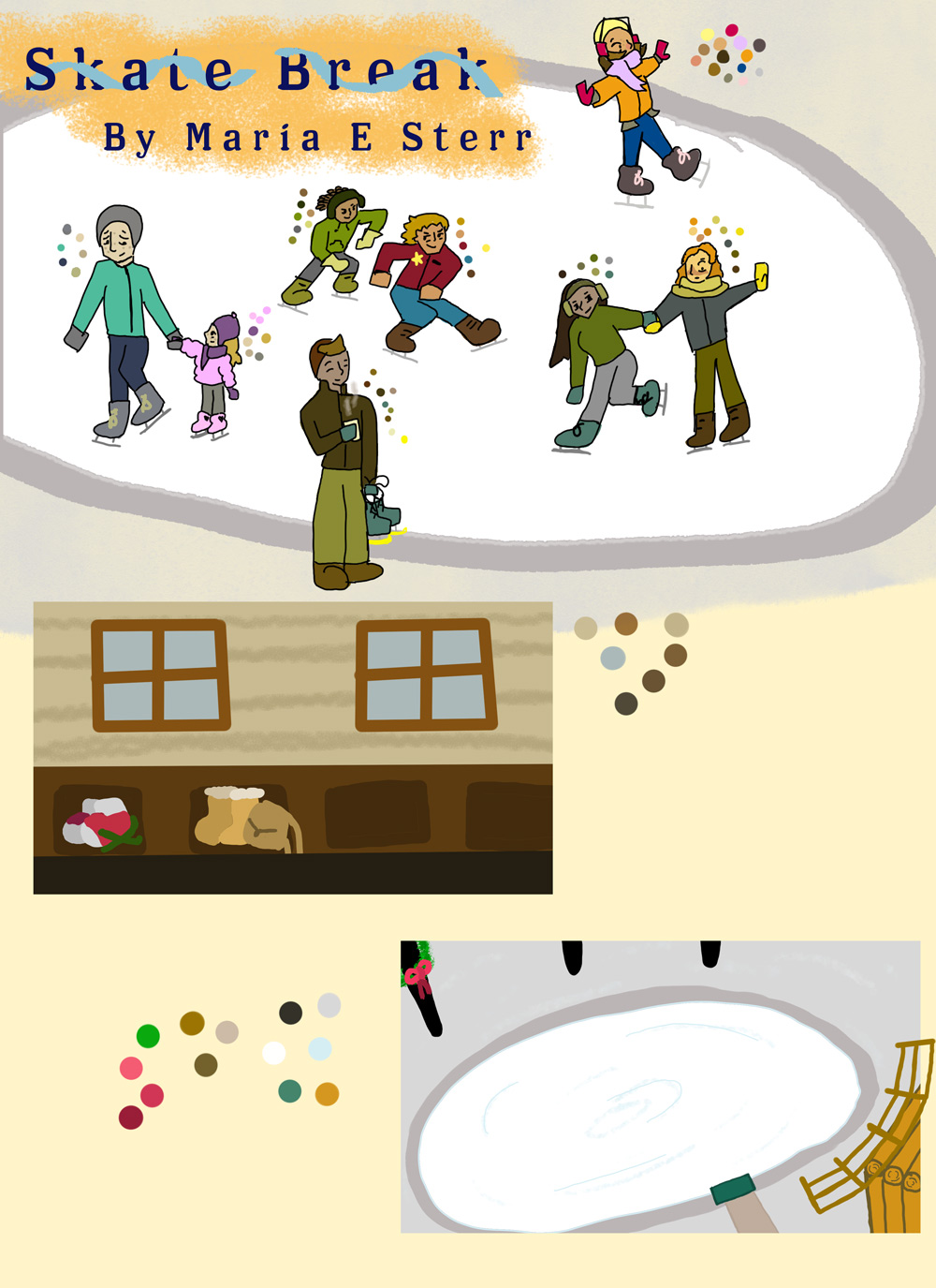
For the background I wanted to get the vibe of the two different locations, so I did one outside and one inside. For the one inside I wanted to do naturalish tones of brown to get the idea that it is in a log cabin like structure. I added the small details of shoes and purses in the cubbies to get the vibe that it is in use.
For the outside, I didn’t want to make the snow just white since I did need to differentiate it from the ice. I made the ice white so I would stand out better and the snow gray. The blue lines are the cracks from the skates. I put the cabin in it to get an idea of how far away it is. Other details are the fence and the lights (the black lines on the left.)
The mood board was easy once I picked out a name and font for the title. The font is called Los Feliz, but I also thought it would be cool to add a ribbon that goes around the letters. All the characters are new and were not in the storyboard since I wanted to focus on the main characters movements. They are meant to be in the background. The exception might be the 2 boys since I am thinking about making them the cause of the character falling after they zip past her. Most of them will be outside to give an idea of life to the environment. The guy holding his skates, though, will be inside. I tried to base these background characters off what I normally see at ice skating rinks: parents helping their kids skate, people with hot chocolate, the kids who are young and better at skating then everyone else weaving through the masses, and the friends who go skating for fun but one of them has not done this activity before. I tried to pick their colors around what I think worked with their design. Funny enough a lot of them were cooler colors. I do not take issue with that since it helps the main character stand out.


